MAY Communication & Events
SERVICEs
Visual identity and website design
PLACE AND YEAR
Venice, Italy; 2020
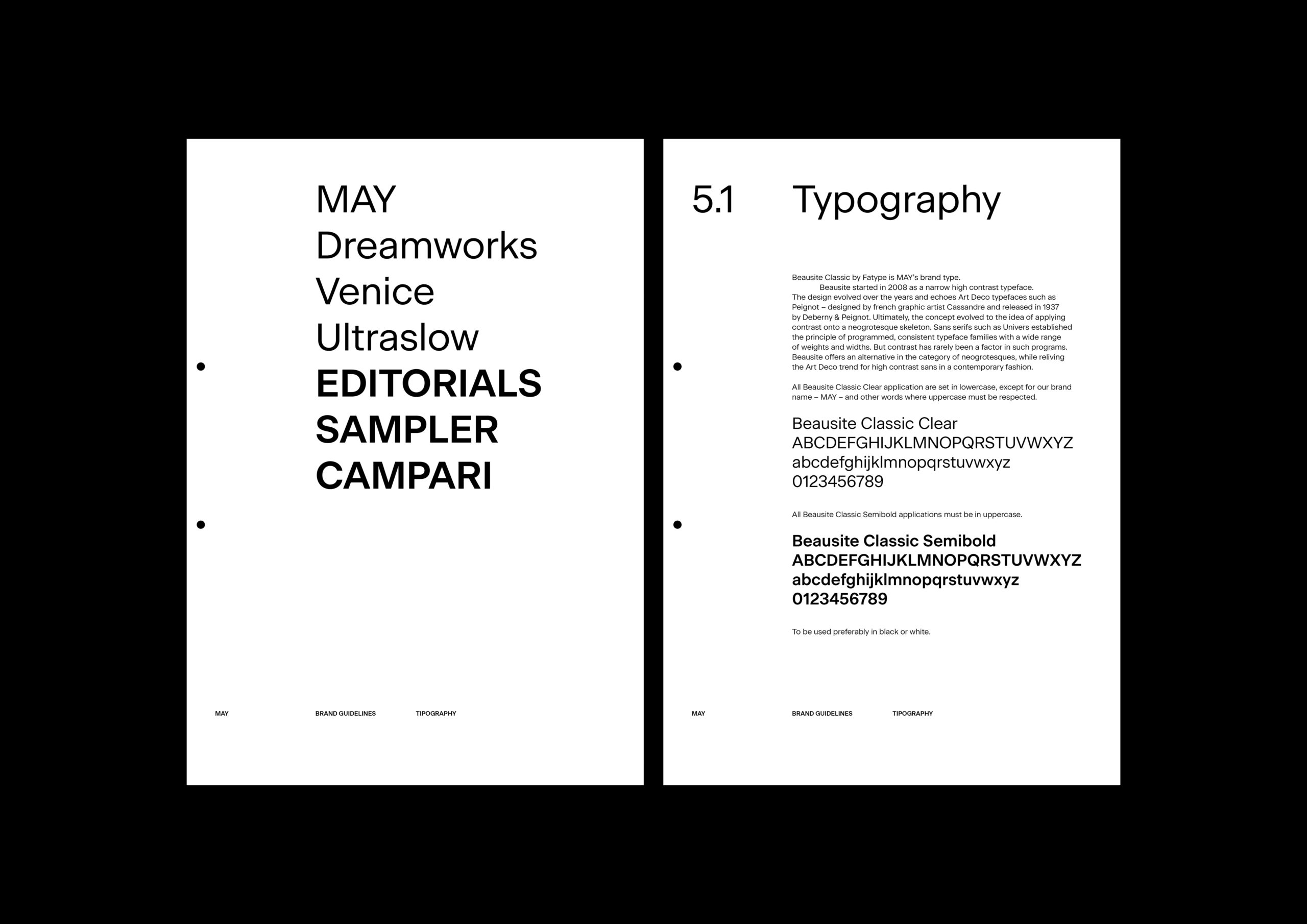
Font
Beausite Classic, Fatype
Paper
Gmund Colors Matt
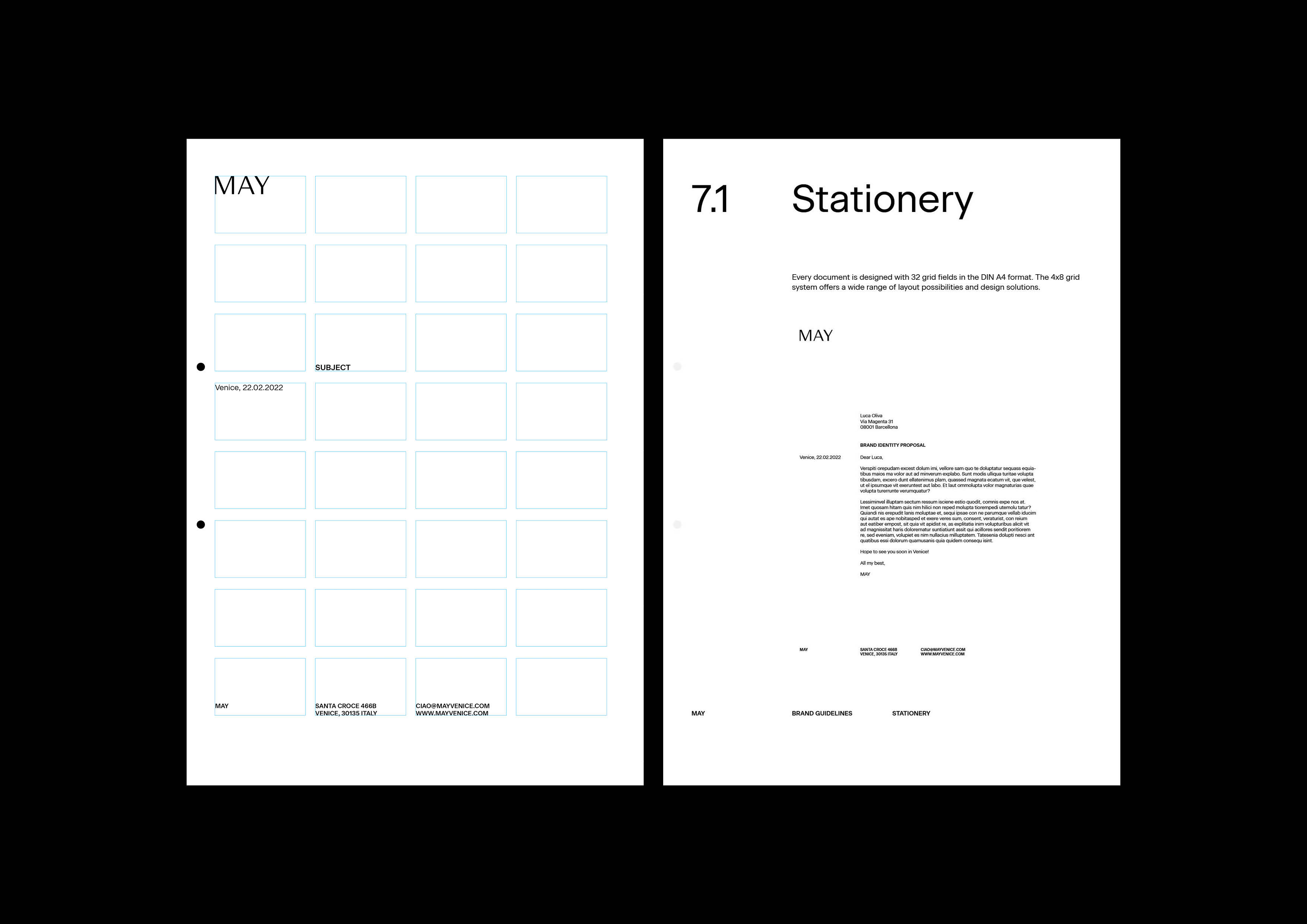
INFO
![]()


Our communication and events company is called MAY and is based in Venice.
We called the agency MAY because it represents the city’s natural and symbolic rebirth: the return of a mild climate after a winter of mists and high tides; the inauguration of the Biennale and the most important exhibitions of the year; the lengthening of the days and the changes of light that shift the palette of the city; a delicate but vivid transitional season that serves as a prelude to the explosion of the aggressive summer life, too rowdy with its blinding sun and festivals.
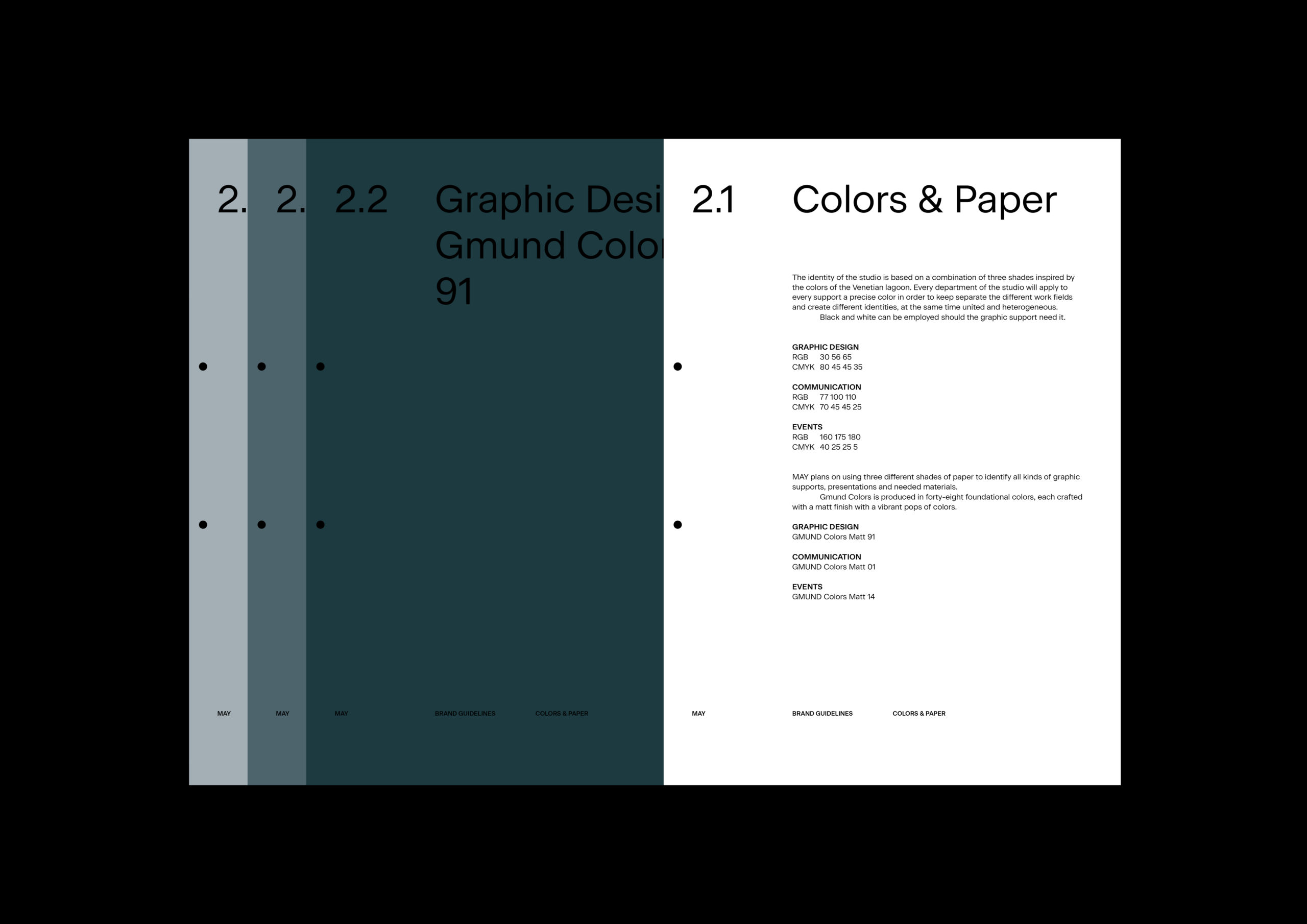
Our palette is inspired by the colors of the lagoon and registers this delicate moment in which the winter colors gradually transform into those of spring and then summer.
Each sector of the agency – events, graphics, communication – is represented by a different shade of the lagoon, which together form a “total”: the agency/the water.
Each sector applies its own color to its graphic supports, creating three different identities that are at the same time united and heterogeneous.
Our corporate identity is based on a san-serif, legible, contemporary, clear-as-water typographic choice.